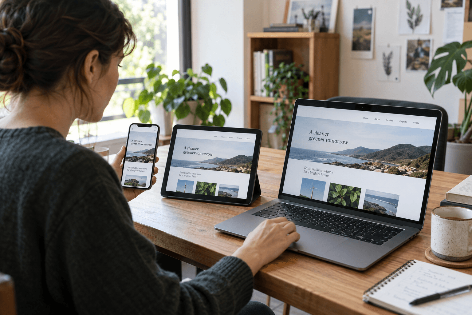
A page can look balanced in the editor and still become awkward on a phone. Long headings wrap, buttons crowd together, and a layout that worked with sample text struggles with real content.
7.1 introduced responsive styling controls, as described in the official release announcement. New controls make a mobile review more useful, not less necessary.
Choose representative pages
Test a service page, a long article, a contact form, and any important commerce or booking route. Include the page with the longest title and the most demanding content.
Do not review only the homepage. Shared patterns can behave differently when text length and media change.
Check transitions, not just device presets
Resize gradually and look for the point where the layout stops working. Test portrait and landscape orientations on a real phone where possible.
A layout can look fine at two preset widths but fail between them. Note the actual condition, such as a heading colliding with a button, so the fix has a clear target.
Follow the reader's task
Open the menu, follow a service link, complete the form, and recover from a validation error. Check that the main action remains understandable and reachable.
Our WordPress speed optimization guide provides related performance context. Visual fit and usable interaction should be reviewed together.
Review content after styling
Check cropped images, lists, tables, and long links. Increase text size and confirm that important information is not clipped or hidden.
Avoid solving a crowded layout by shrinking text until it is difficult to read. Simplify spacing or structure where the content needs more room.
Record the result before release
Save the pages tested, devices used, issues found, and fixes verified. Keep known limitations visible to the person approving the release.